The strength of the team is in the diversity
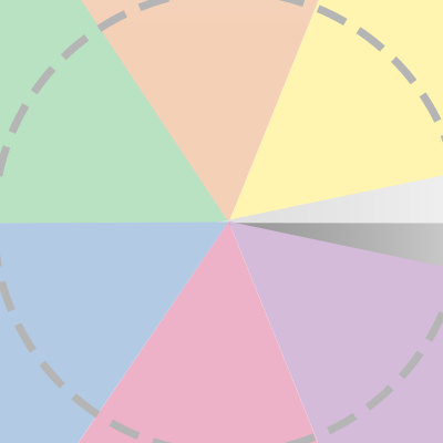
Some of our partners brought the diversity graph and it’s complexity to our attention. Therefore, we decided to take a closer look at this graph. The result is an improved diversity graph which is supporting the group logic better. The way to read the diversity graph hasn’t changed though.
These improvements will be implemented in all MD systems. Make sure that you update the applications like the MD Viewer towards the latest version to see the new diversity graph. The online MD Viewer is accessible on viewer.managementdrives.com and is updated automatically.
Improved diversity graph
More accurate center
We show a team based on it’s strength. The calculation of the center of the graph is more accurate and based only on the logic instead of the complete profile. This means the current graph cannot be compared with the new version.
Participants are clustered
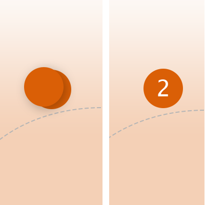
Participants, close to each other, will be clustered. This makes the diversity graph clearer and it becomes easier to show the names of each participants.
Seperation of profiles in the gray segment
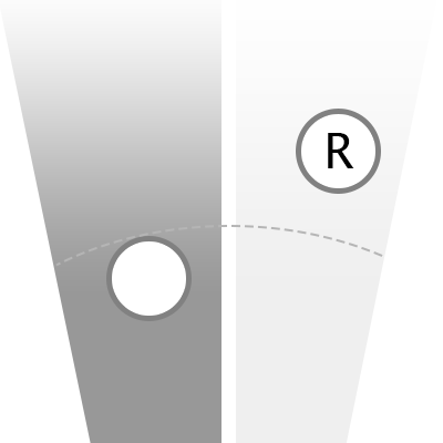
Currently participants with a flat profile and those with a high R score both are plotted in the gray segment. We will seperate this two by adding another coloured segment. This makes the graph easier to read and explain.
Showing the R as second steering colour
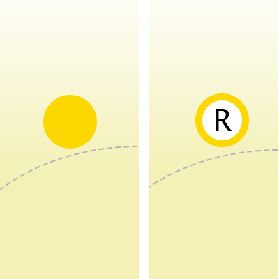
From now on, a person with the R as a steering ‘colour’ will be shown as a second steering colour by adding a white circle and a R in the middle. This provides additional information and improves the interpretation of the diversity graph.